How I turn static designs into rich experiences
I’m preparing a workshop at Wey Wey Web about motion language, which made me realise how many of my habits and instincts for creating web animations have become automatic, here’s my attempt at writing them down.
While I’m designing animations, I’m considering a lot of things at once. What does an animation do for the user experience, does it guide, clarify or just add delight? What feeling am I trying to evoke with the animation and does that fit with the other animations on the website. Which parts of this animation can I reuse elsewhere to not only keep animations consistent but also reduce the amount of code I’ll need?
Composition
I often receive static designs, flat compositions with little to no motion direction at all. And that’s completely fine, not every web designer thinks in terms of movement, some are just not very good at animation tools, but for me that’s perfect. Designing motion is one of my favourite parts of web development, and, like Matthias Ott has preached since 2020, the web is our best tool for web design.
Matthias Ott – Painting With the Web“We are limiting our potential for playful exploration and for creating surprising and novel solutions. And, most importantly, we are limiting our ability to make conscious, well-informed decisions going forward. By adding more and more layers of abstraction, we are breaking the feedback loop of the creative process.”
Some compositions just invite motion; I can almost see how they should move from looking at a flat Figma file. Take this sketch for Hamid Sallali’s portfolio, for example:
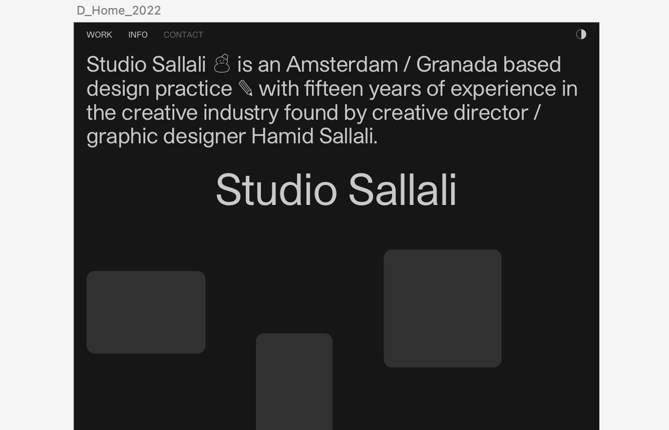
The layout instantly suggested an entrance animation, something that would guide users to start scrolling. I imagined the work items as physical cards being tossed on the site’s surface. That metaphor gave me everything I needed: a starting composition, a motion direction, an easing curve (elastic) and it even helped me figure out what timing I wanted to use. Once the metaphor clicked, the rest followed naturally.
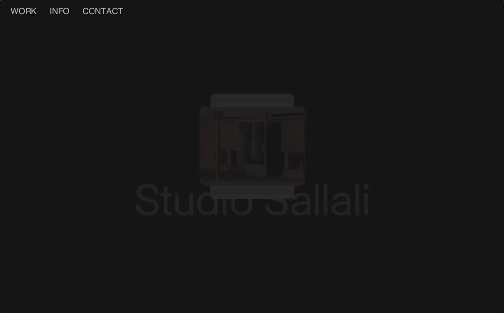
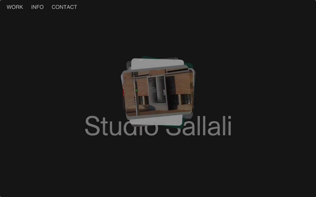
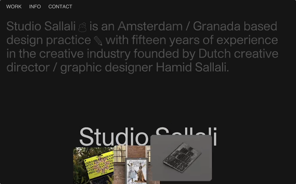
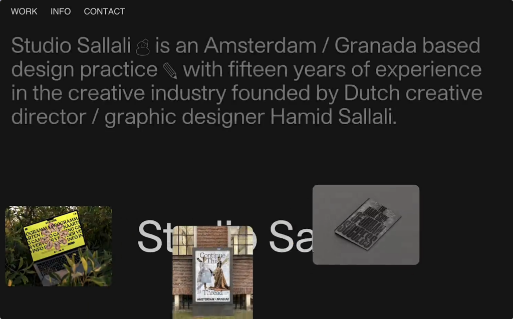
After creating the entrance animation it was easier to come up with other animations, I reused the entrance animation in reverse on the work popup for example.
Direction
I love a good metaphor, and direction is a powerful way to express it in motion. On the 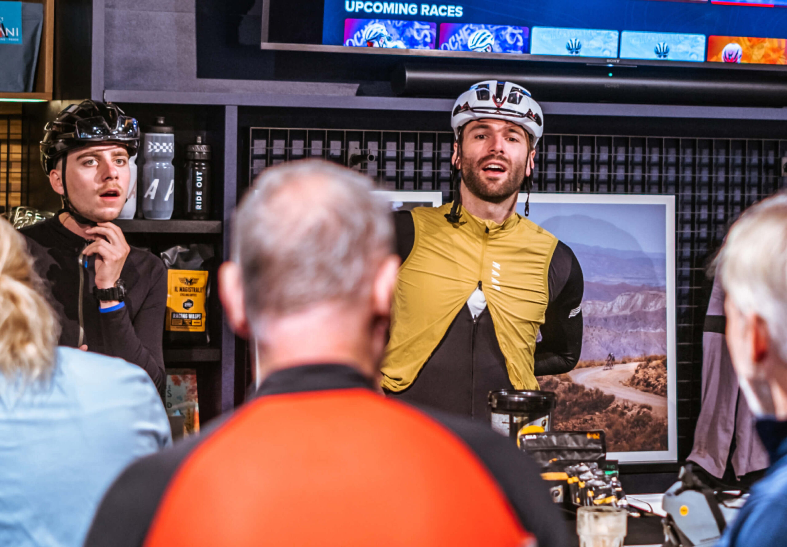 Ride Out AmsterdamRide Out Website, an experimental bike store, I wanted the animations to feel like forward movement. So I leaned into transitions that travel from left to right, echoing the experience of riding and momentum. Keeping directions consistent across animations can give your site’s motion language a cohesive feeling. When elements always move in a way that makes either spatial or emotional sense, forward for progress for example, upward for discovery, downward for closure, users can start to feel the underlying logic you’ve created without actually noticing it.
Shapes
Another way I come up with animation ideas is by looking at the shapes of elements. I’ve been obsessed with clip paths since 2018, they are such a great way to animate shapes from one state to another. Something silly like the shapes in this header that animate between shapes adds a lot of personality to an animation.
For 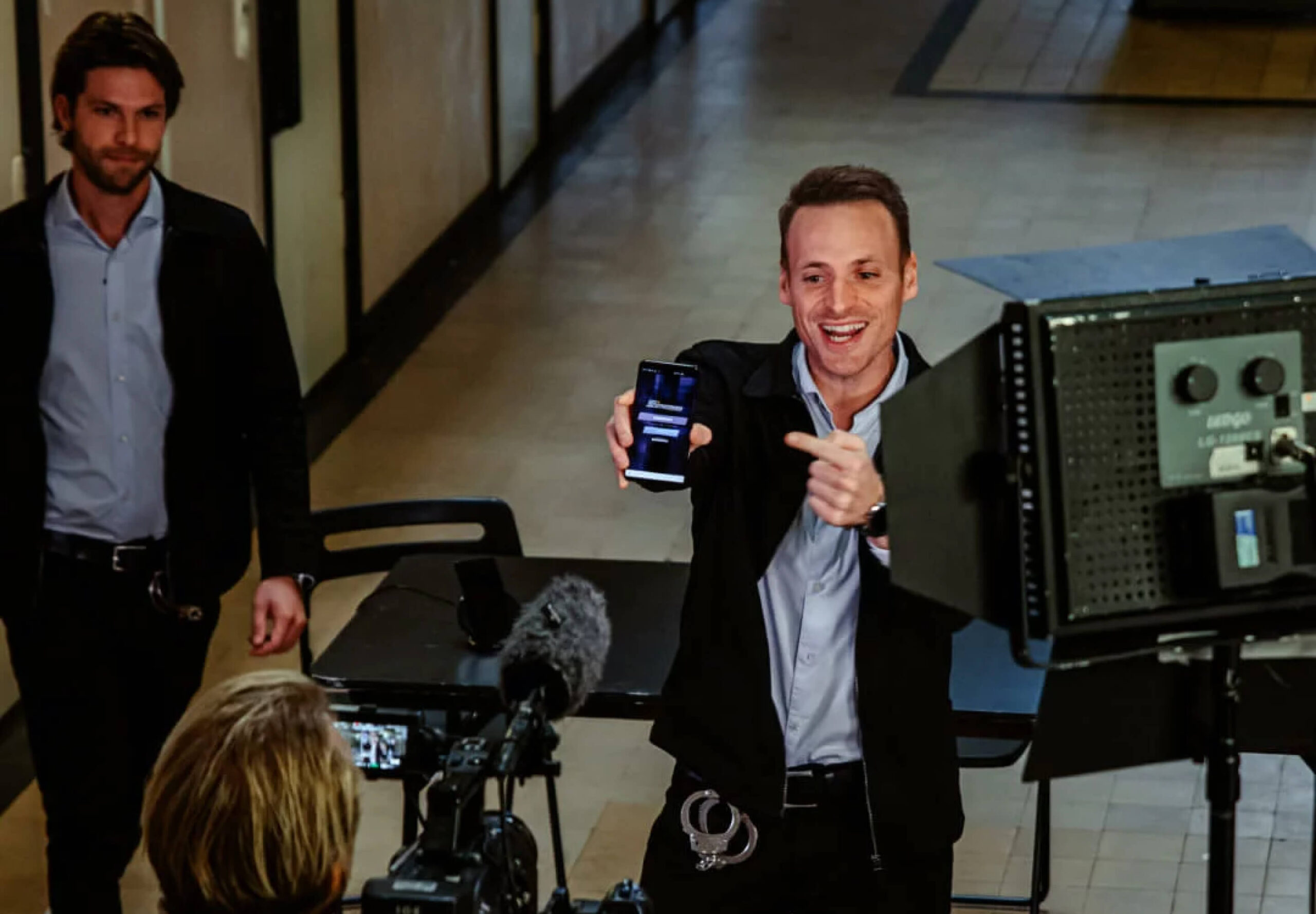 Talpa StudiosTalpa Studios I used clip-paths to animate between the different aspect ratios in the header carousel, the day I found out you can round corners using
 clip-path: inset() was a very, very good day. The clipping animations are repeated in various ways on multiple elements on the website giving it a consistent look and feel.
TL;DR
When you receive a static design from a designer, treat it as a carte blanche to come up with animation yourself.
If you’re not sure where to start, look at the composition and shapes. Then think about direction, duration and easing to shape the feeling you want to convey. But always keep in mind what an animation does for the user; does it clarify, guide their attention or is it just meant to delight a user?
And don’t forget to think about reusability. Repeating motion patterns build recognisability, help users anticipate interactions, and it saves you some loading time.
Last updated: January 15, 2026
18 Webmentions
Join the conversation on Bluesky
Mentioned on other websites: 1
Likes 15


Reposts 2
Webmentions are a way to connect with other people who have shared your work.